JULES HOEPTING
Managing Editor
This is the satire section of the paper, but everything I am about to tell you is totally true — not exaggerated at all. Really. As one of the head editors, I deemed this topic too comical to put in any other section.
All summer, I gave campus tours, showcasing a shell of a campus with lots of obstructive construction.
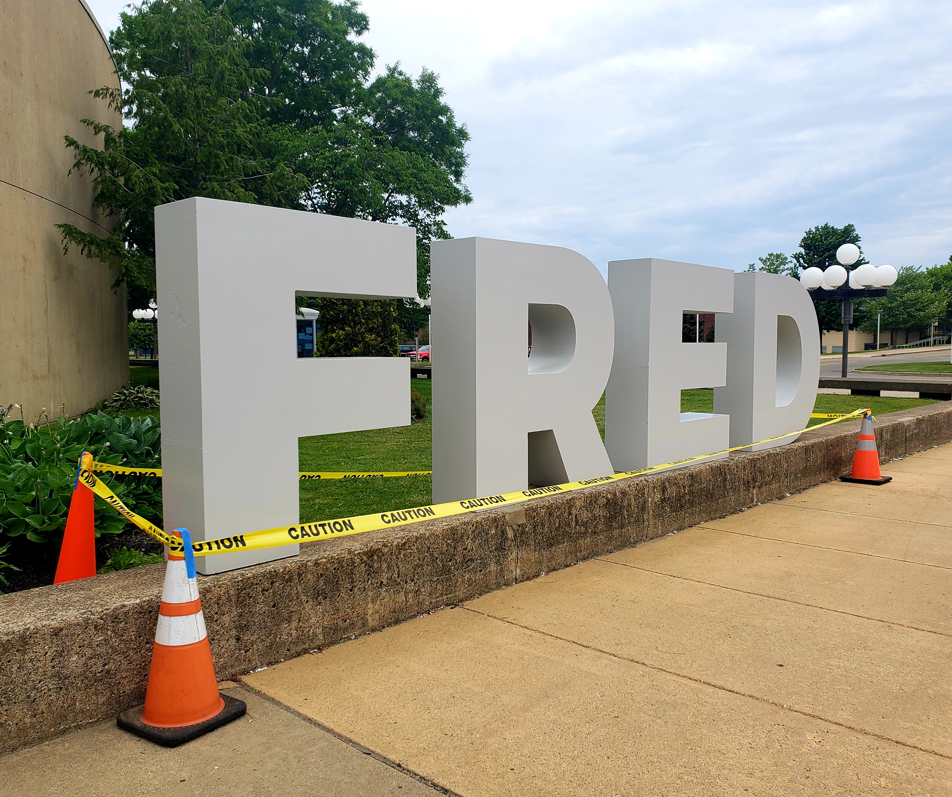
On June 18, I noticed four huge grey capital sans-serif letters spelling the word “FRED” in front of the William’s Center.
“Spiffy,” I thought to myself.
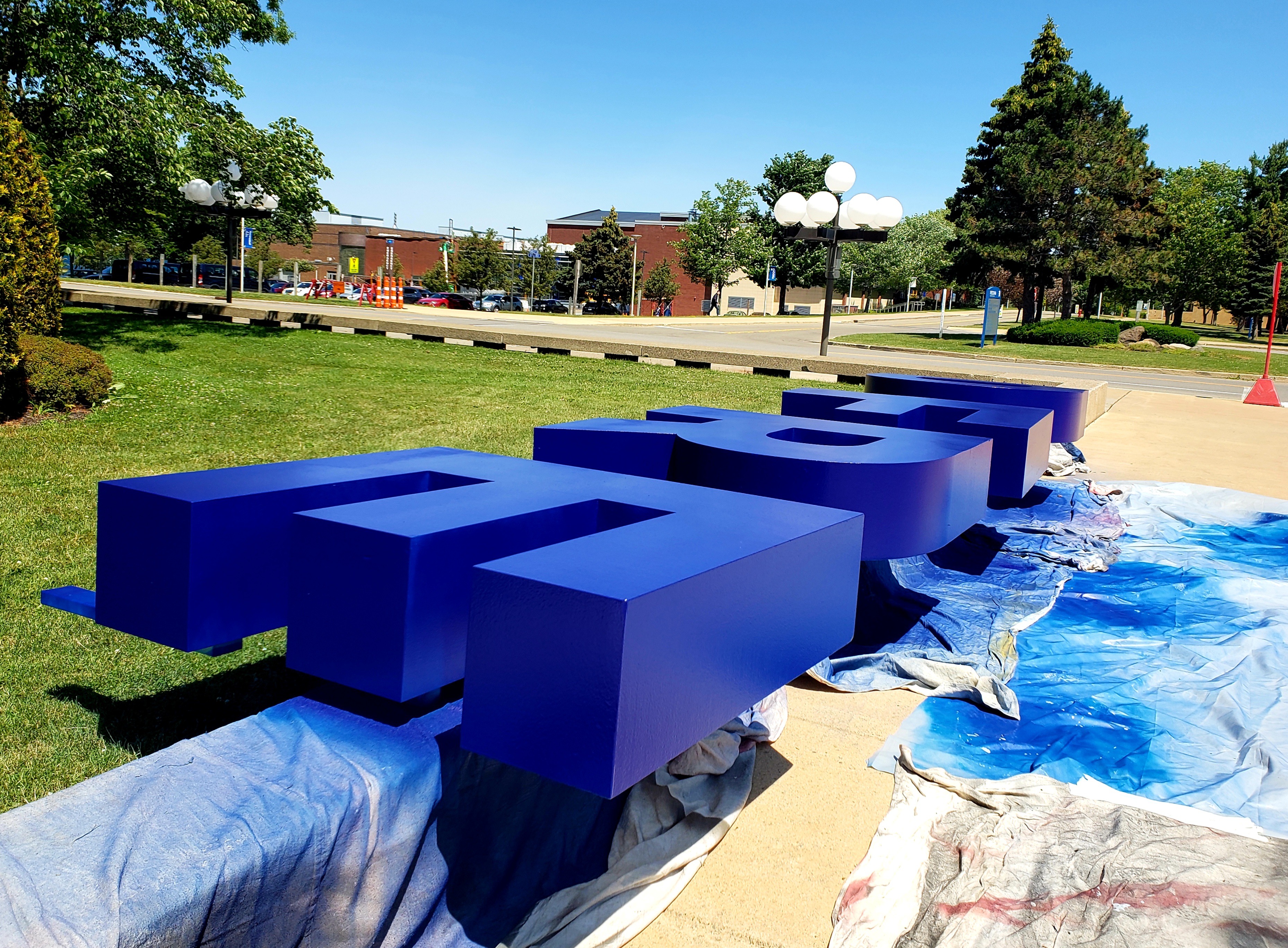
The following week, I led prospective students through the ghost town university and came back to find the sign was blue. Additionally, support beams had been added to the back of the letters.
“Pop of color. Nice,” I thought to myself.

Then they had to repaint the letters because the blue wasn’t dark enough, or something like that.
At one point in the painting process, the letters were all scratched up because they placed the letters on bumpy concrete while the paint was drying.
At one point there were a bunch of bugs stuck on the paint. You know, because it’s summer, and insects are ubiquitous.
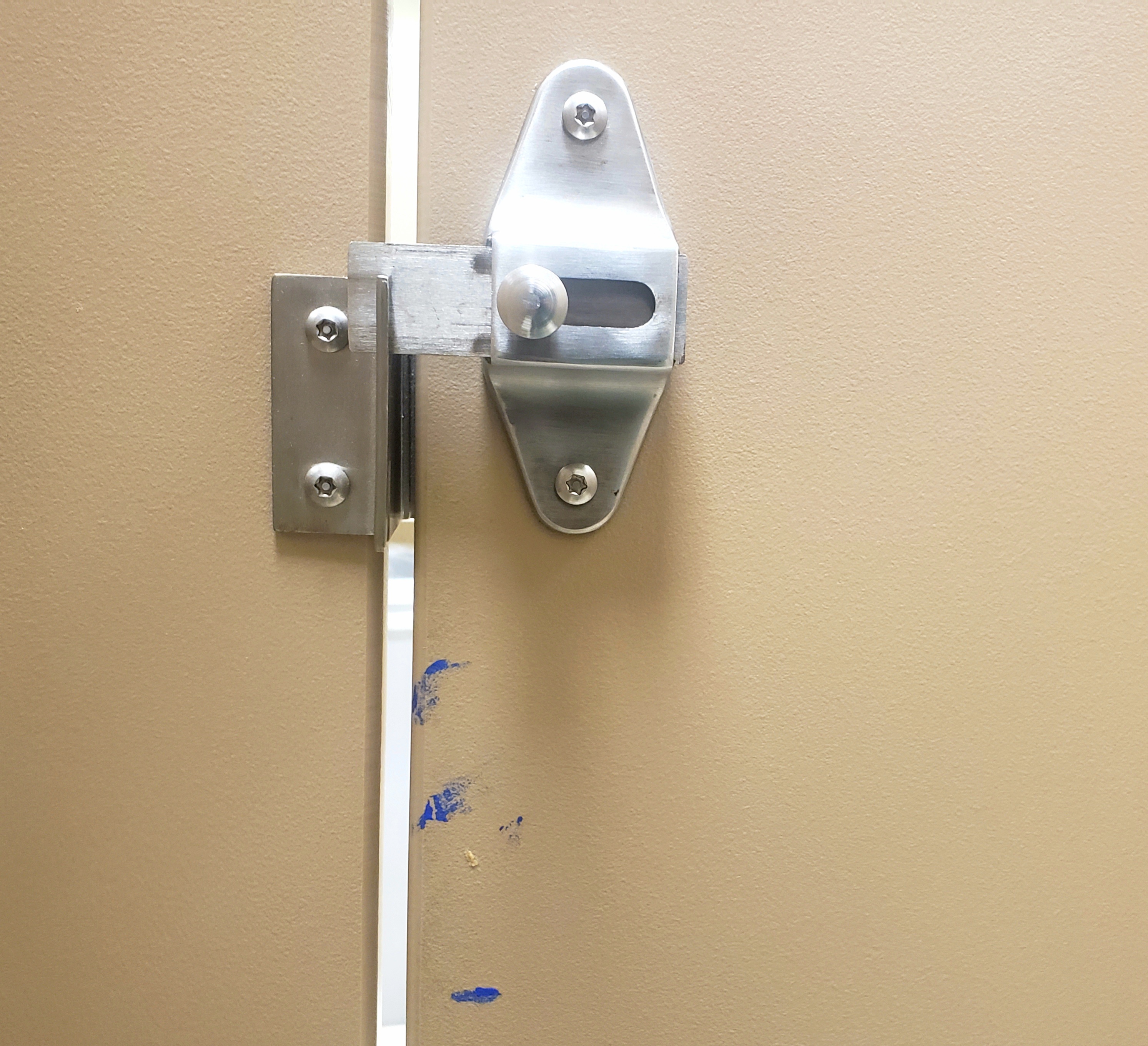
At one point a painter came up to me and asked me where he could access water in the William’s Center — if there was some sort of hose or something. Something to do with washing paint. If you look closely, there is blue paint on one of the William’s Center bathroom stalls.*

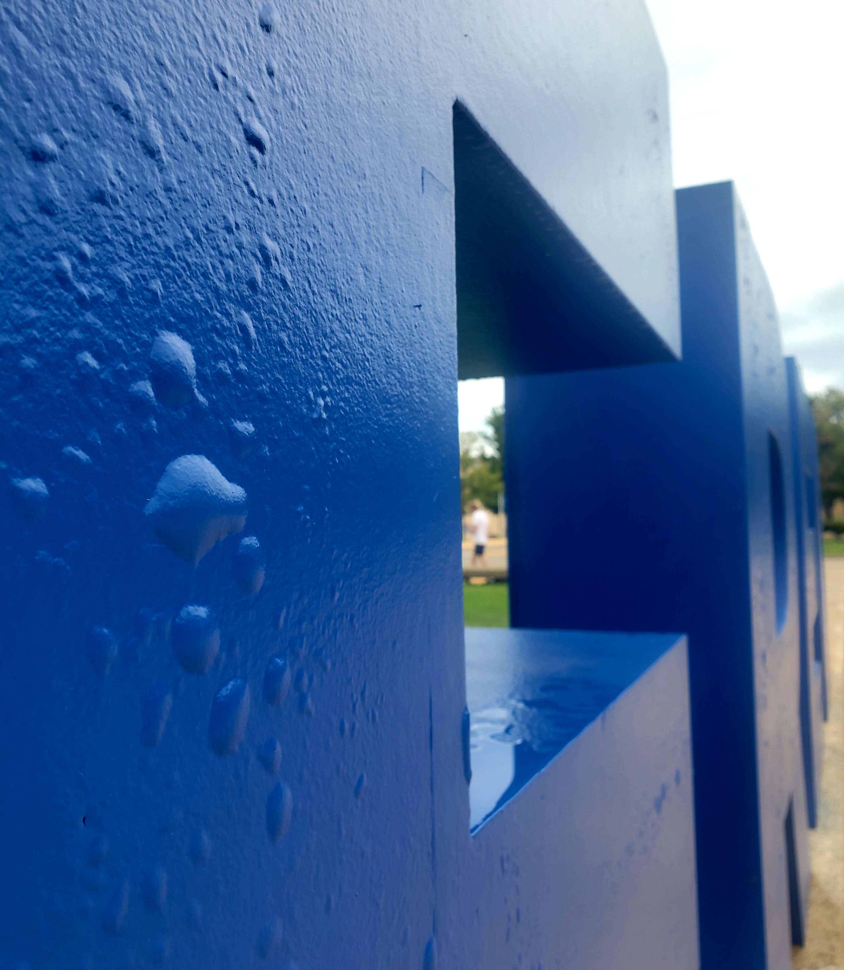
Then the bubbles started to emerge on the surface of the letters, looking like the skin of a spokesperson for Proactive before face-tuned photos. Everytime I passed those letters I felt inclined to pop the bubbles. A few weeks passed and I passed an employee living out my fantasy.

Then the students came, scaring away locals who walk their dogs on campus in the summer. The students climbed up those letters and posed all cute and took pictures and posted those pictures online. Now the whole world can know they were at “FRED”: an inelegant abbreviation for “Fredonia” which reads odd out of context.
You went to Fred? You climbed on top of Fred? Why have I never met this Fred?
To be frank, I don’t dislike the sign. It was created as a part of a promotional campaign for the college and I think the sign really encompasses Fredonia’s essence. Take that as you will.
*There is no evidence the blue paint on the bathroom stall is from the sign.
